K!RAK!RA Fashion Publication
Objective Part 2
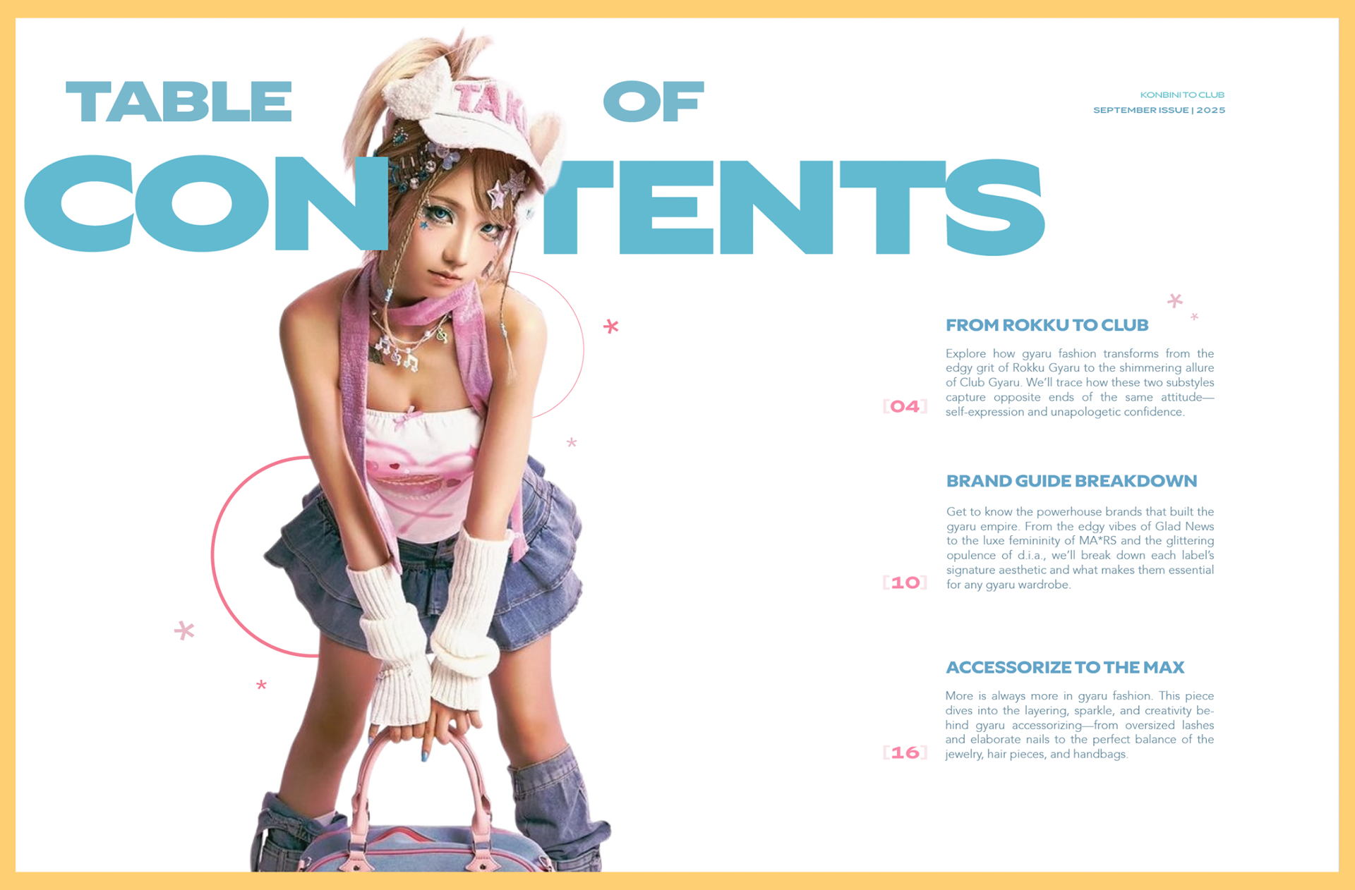
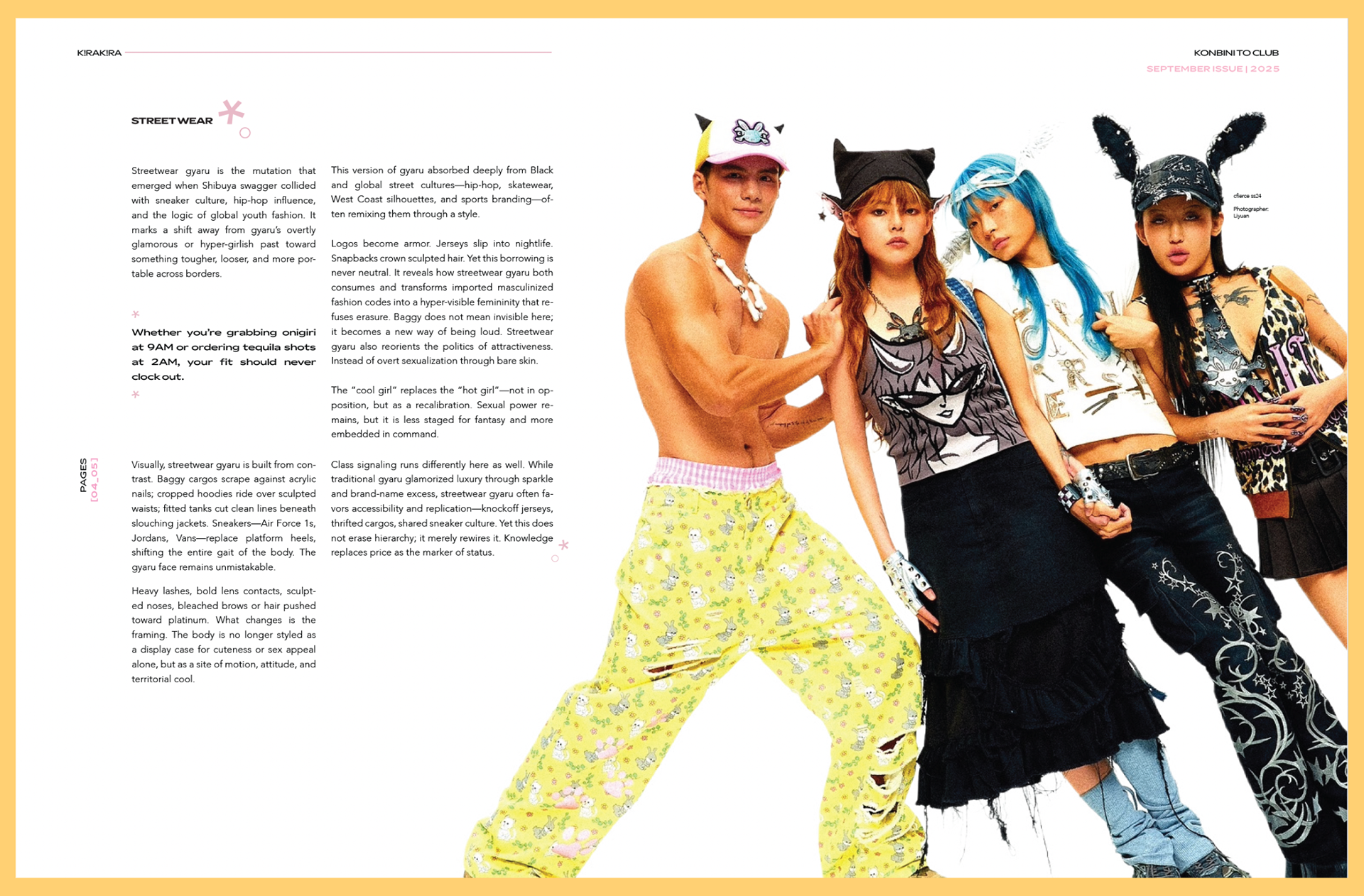
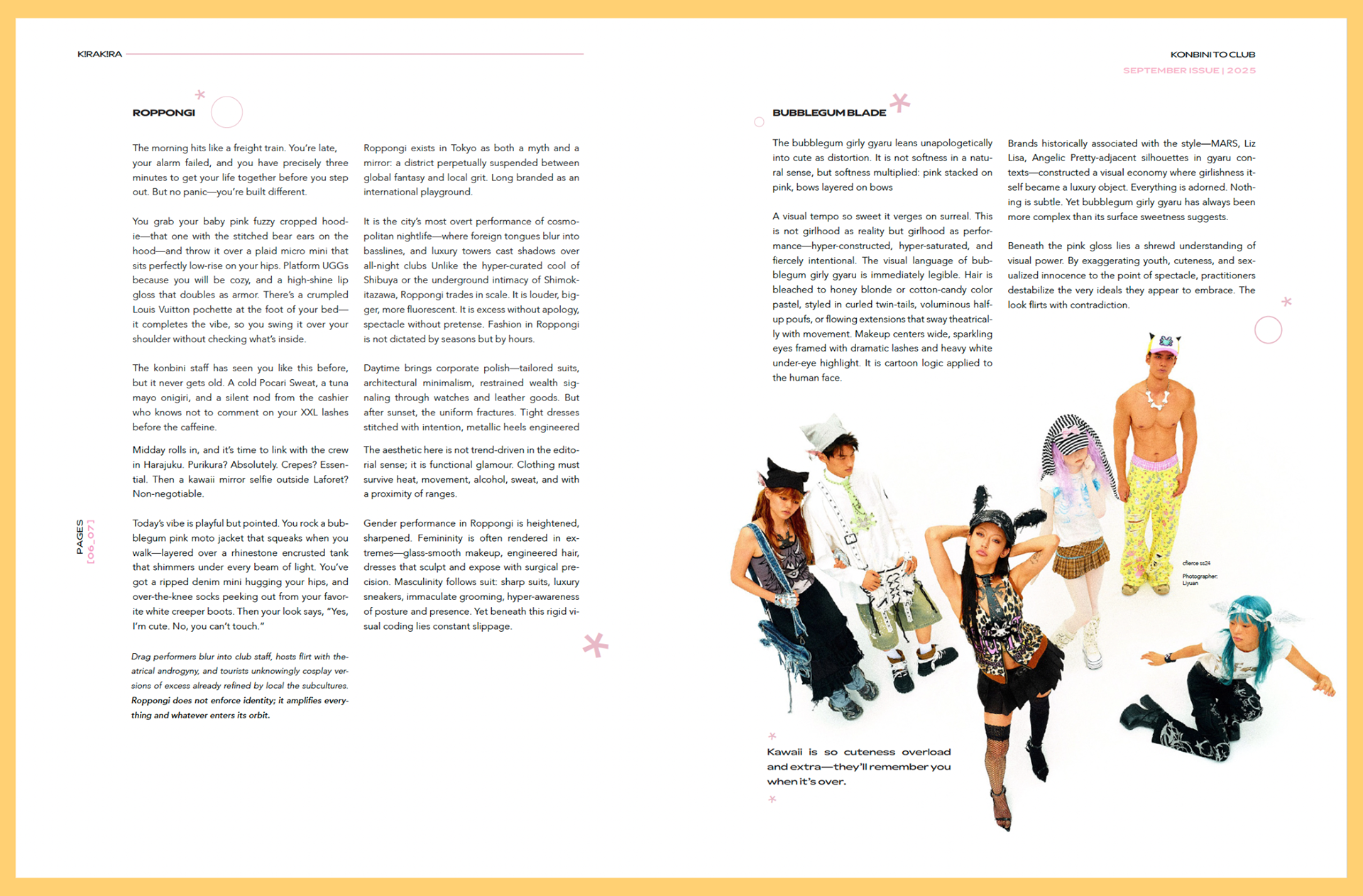
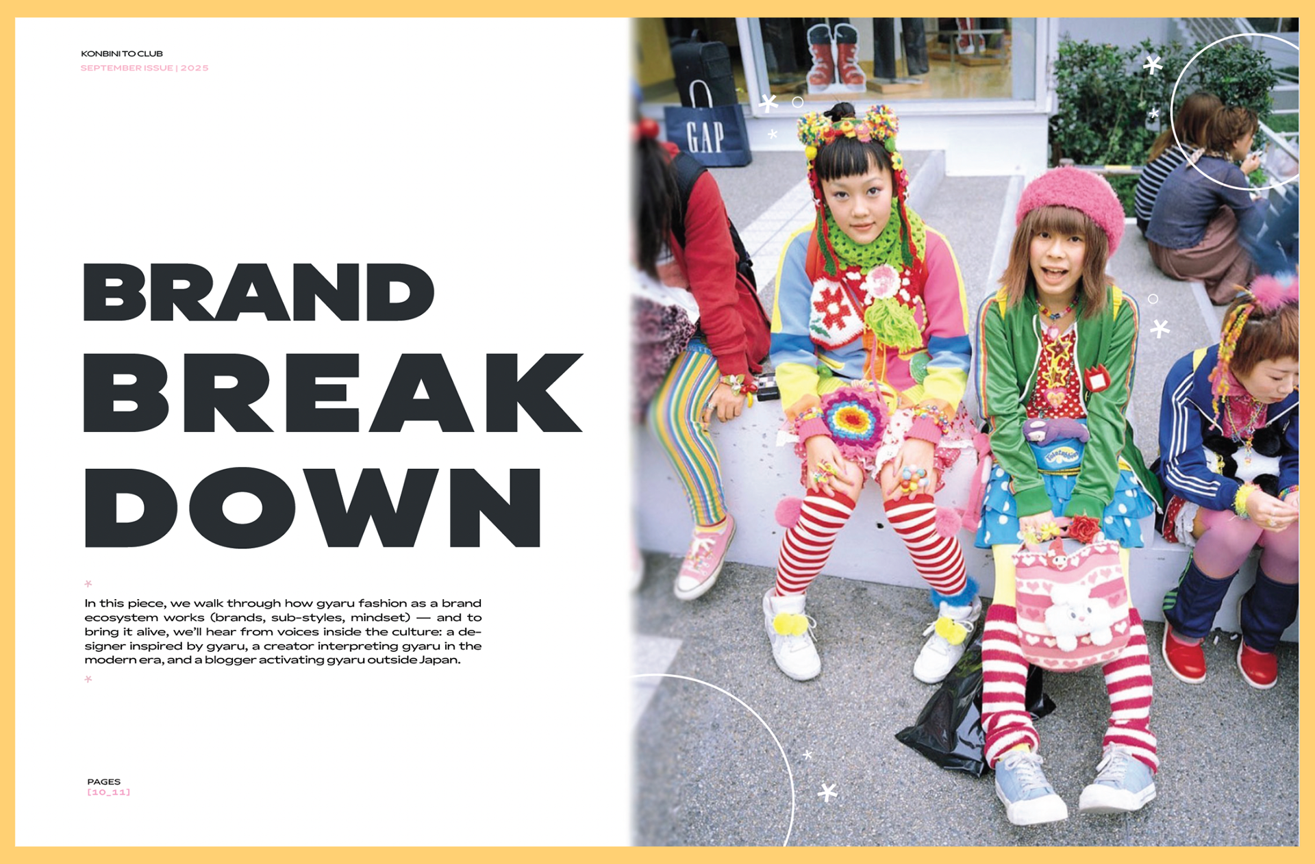
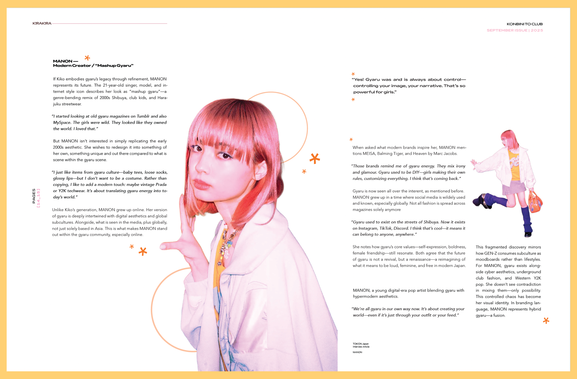
Now onto the literal magazine itself, this publication I wanted it to be easy to digest for all readers. Whether you're a seasoned veteran in gyaru, or just starting to dabble in it. Because of this, I wanted my publication to have some sense of glitz and glam, but ever so slightly simpled down, so that the reader would be able to comprehend the beauty of the fashion through it's text and slight imagery.
Research and Benchmarking
This was done by accumulating photos that could be used throughout this piece, as well as layouts that the text could be placed in, then adding the images!
Final Compositions
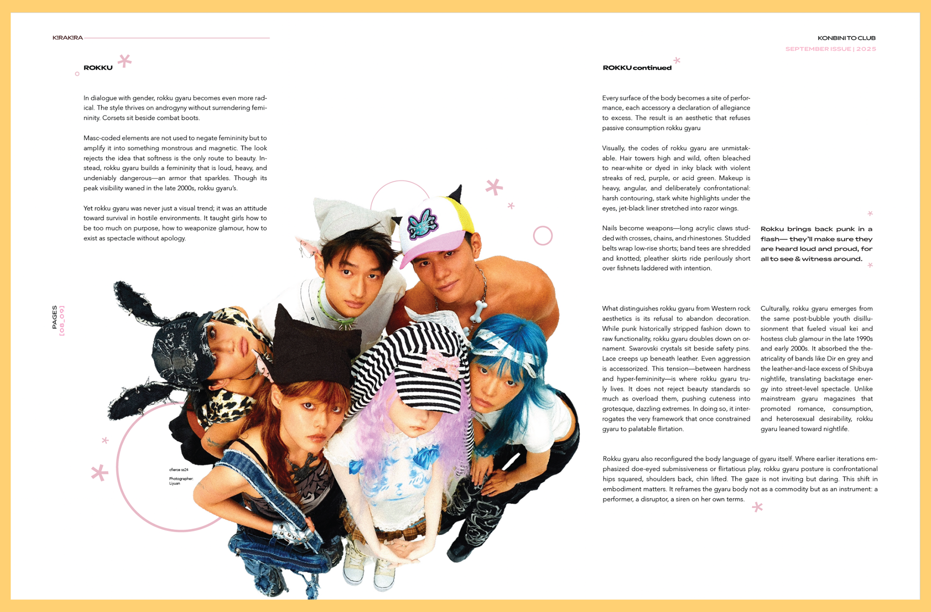
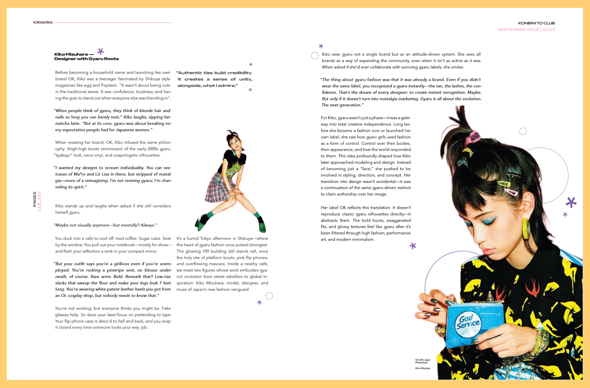
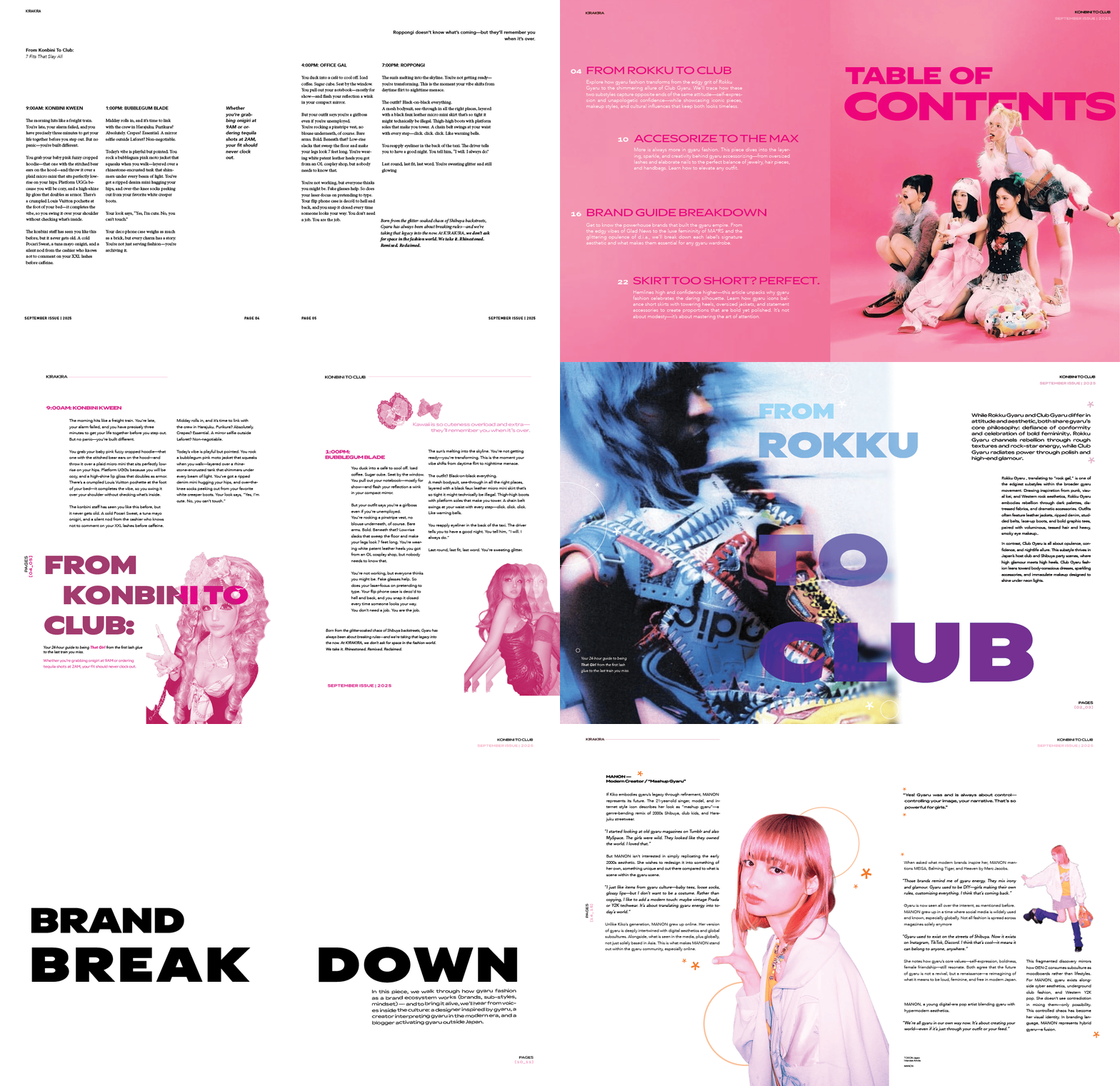
Below are my final compositions plus layouts! I am rather proud of them, as I'll admit, this was a tricky one as the compositions were easy, but images were hard. To find a bunch of images that flowed together felt like a challenge, but in the end I overcame it and you all can see the final result for this publication.
Objective
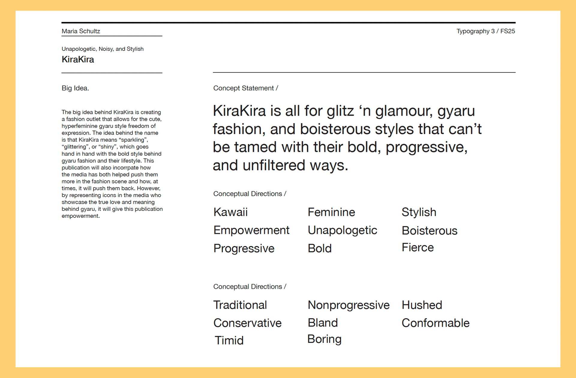
Designing a fashion magazine that is oriented towards people who are interested in learning more about Gyaru fashion and it's subculture around it.
Research and Benchmarking
Figuring out more about the different subcultures in Japanese fashion, specifically gyaru. While learning what subgroups to gyaru were and what made them different or similar.
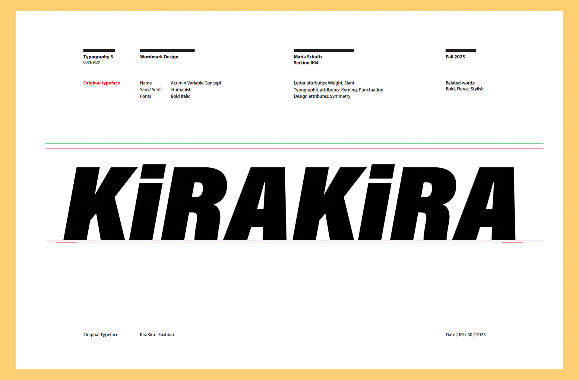
Original Typeface
Starting off with the word mark. I needed a solid base typeface that could align with these characteristics above and that evoke that sense of empowerment, stylish, and progressive energy before even adding any adjustments.
In turn, I picked Acumin Variable Concept in bold italic. This was due to many of it's features such as the small swoops placed throughout it which had potential for more, or the thickness/boldness it held even italic.
Wordmark Iterations + Ideations
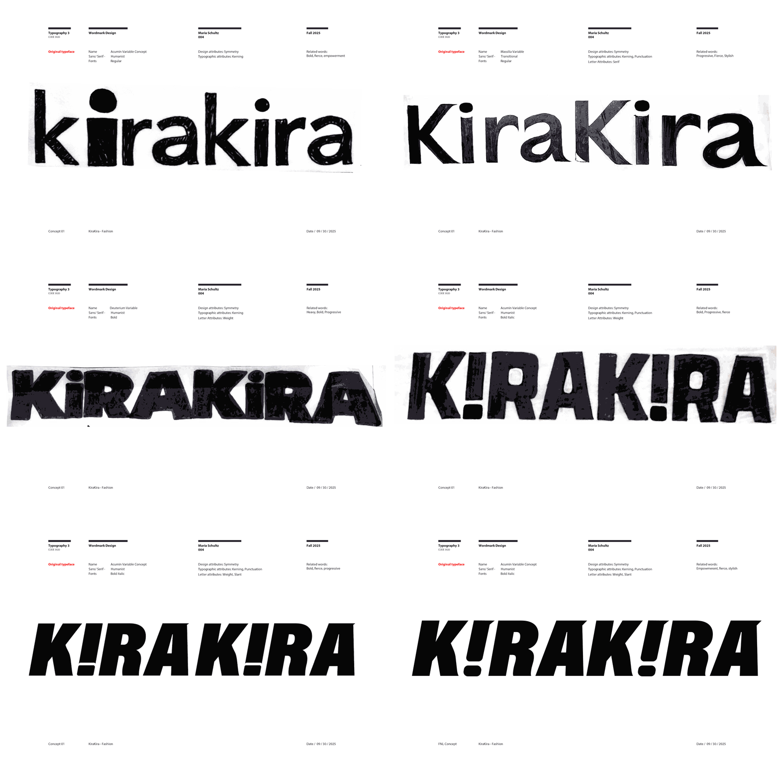
It had to be strong, empowering, and have a feminine appeal. Something that screamed what this fashion was about, and it's attention to detail. So, this was accomplished through many trials and errors, but we were heading in the right direction. Attached below if a process gif of almost all of my work from the iteration and ideation process.
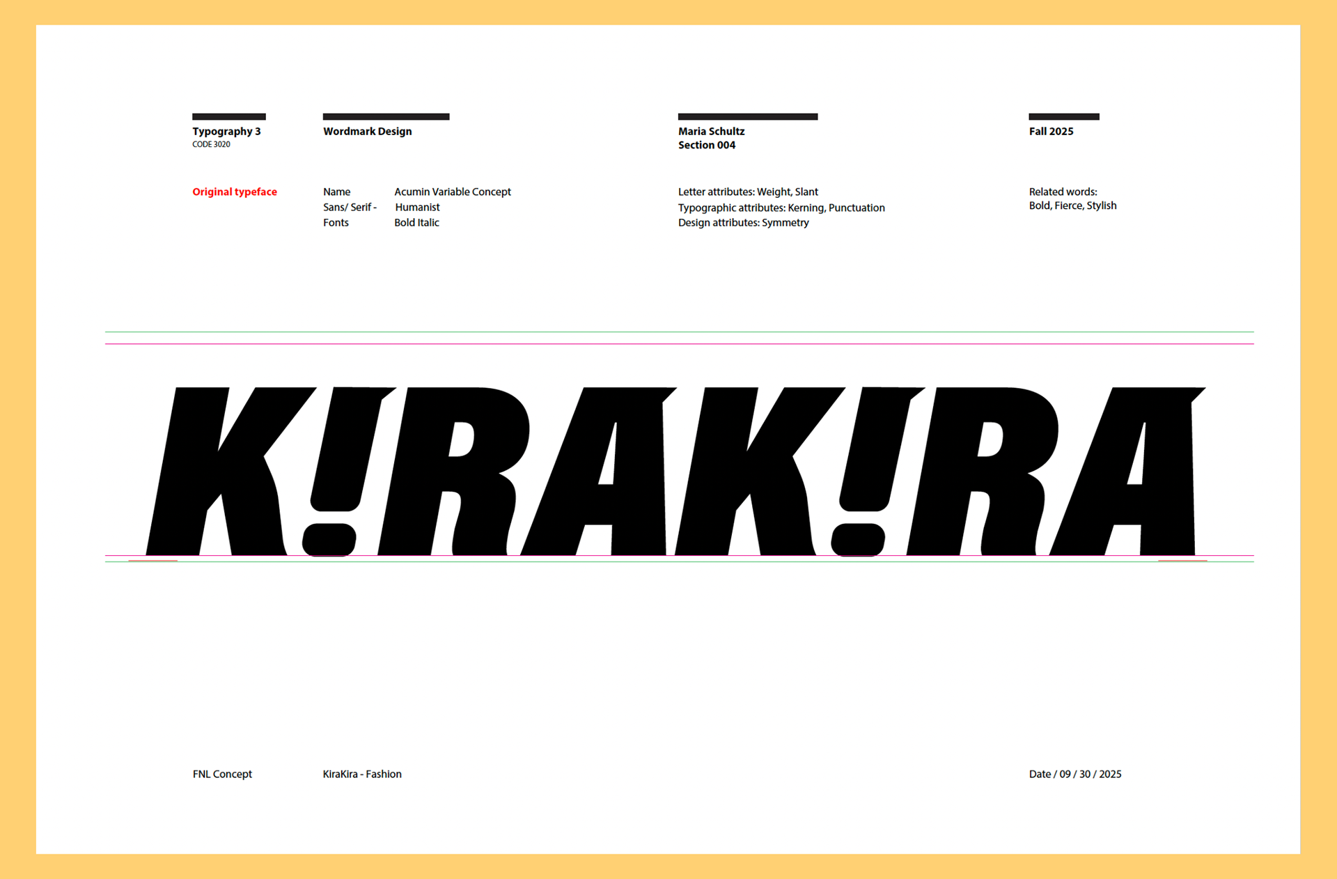
Final Word Mark
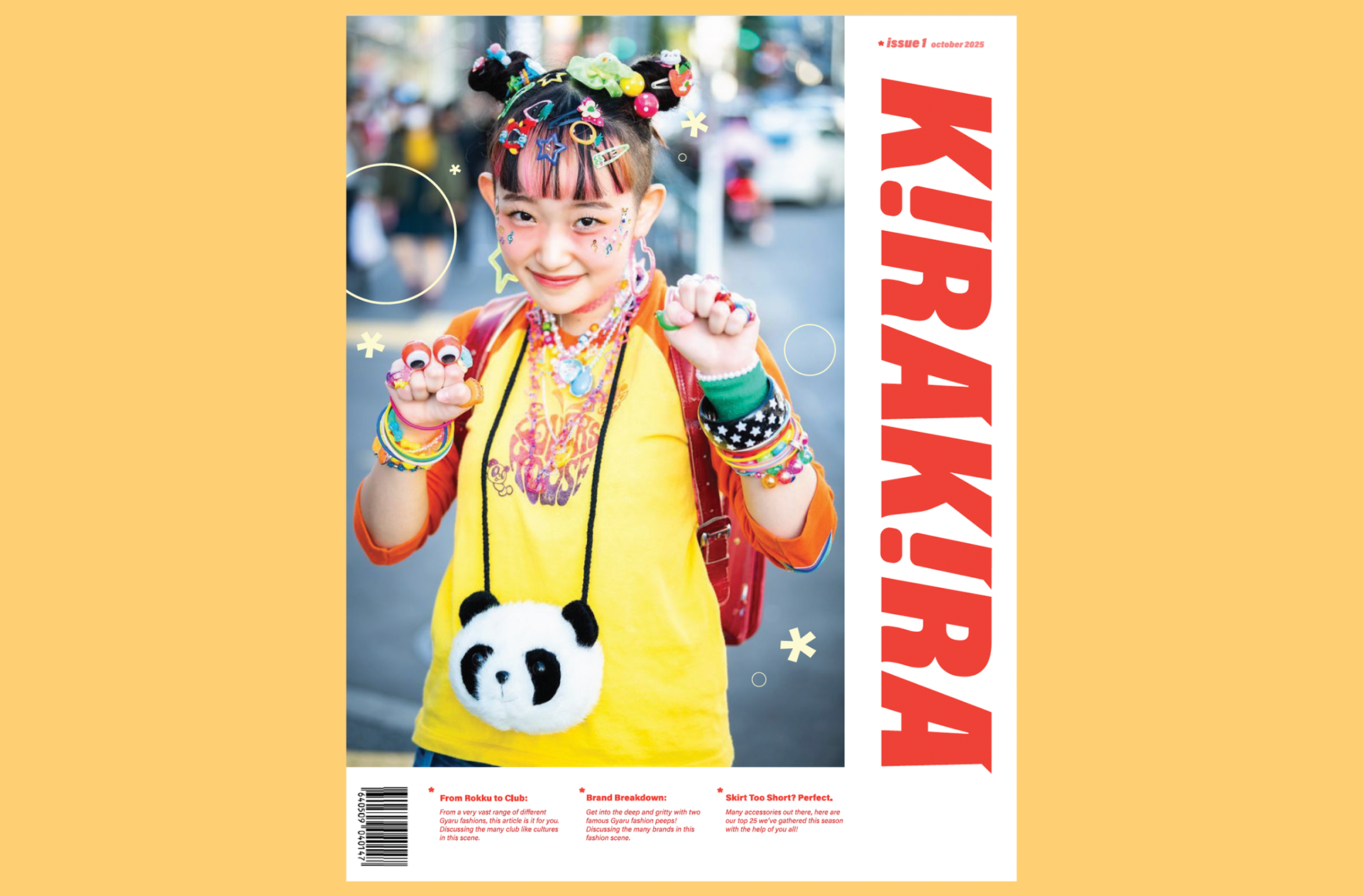
I landed on this fun bold concept in the end, which doesn't stray away too much from the original, but different enough it can be on it's own! I rounded a lot of it, extended and accentuated the curves at the bottom. I also determined to flip the i's around to create that exclamation point feeling that gives it such a sense of progressive empowerment.

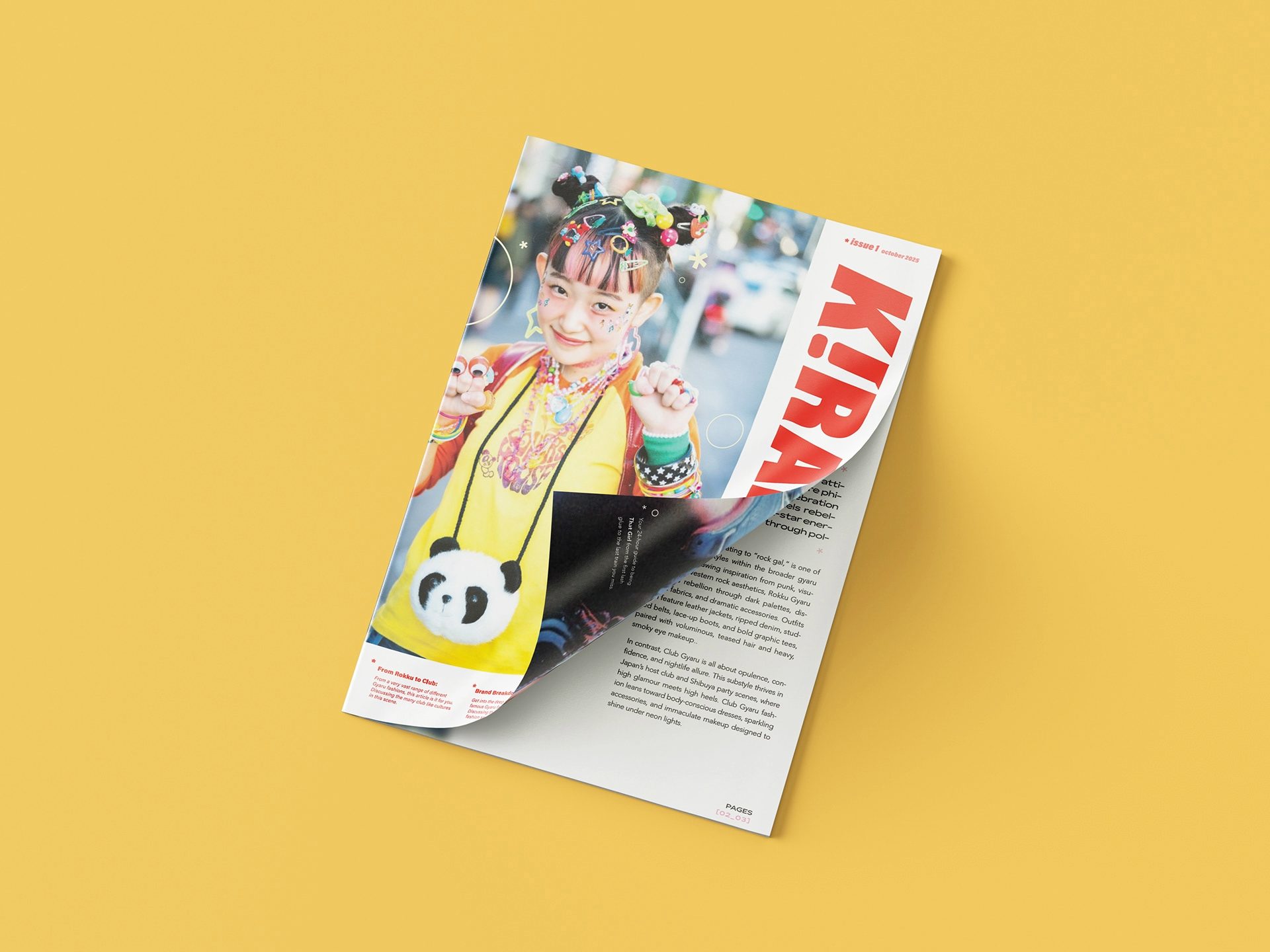
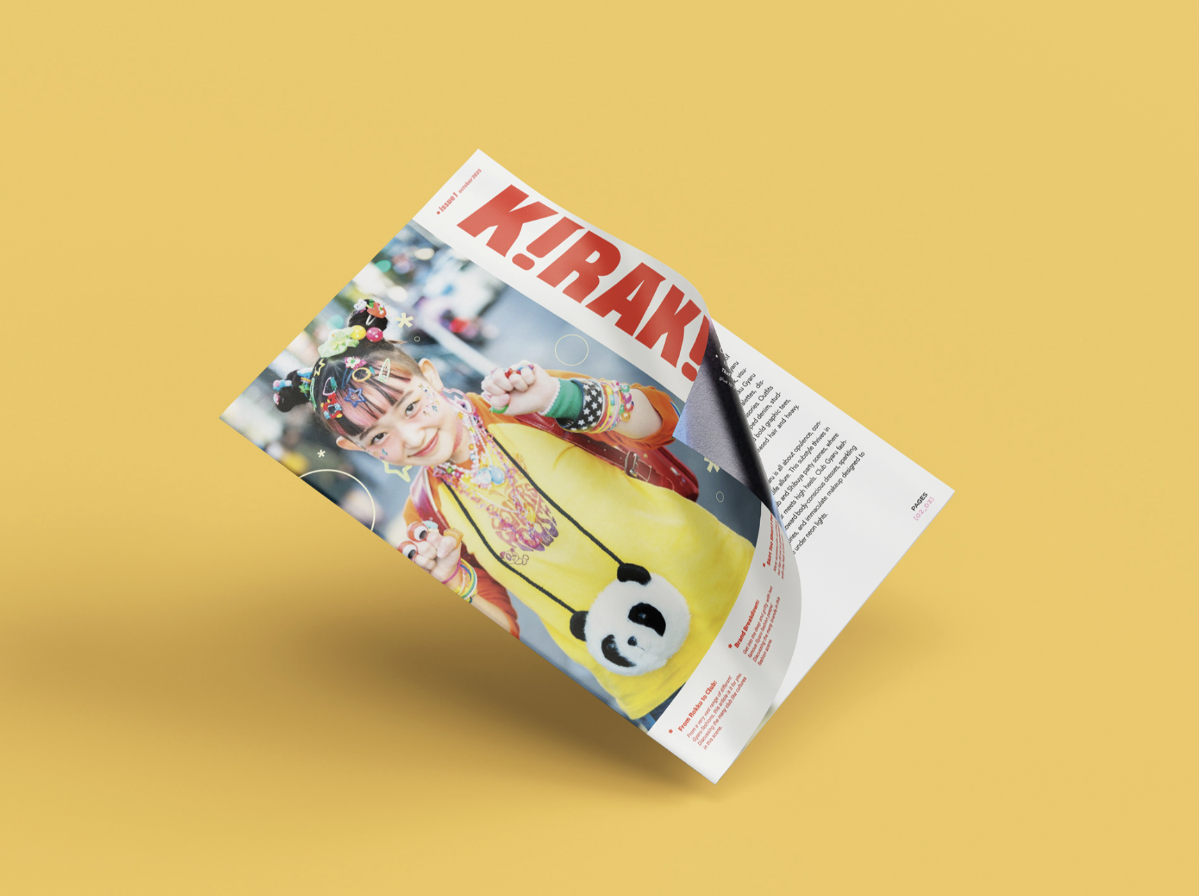
Final Compositions on Products
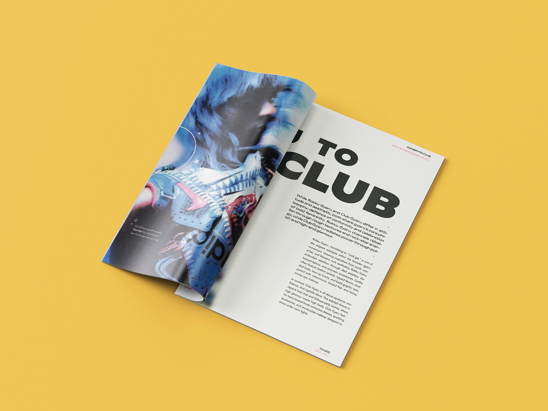
Below are my final compositions on products, such as a magazine itself!